If you happen to Google {or search on Pinterest} fall table settings and the like, oh man looooooook the hell out! Its like opening an over full storage closet stuffed with bags, balls, tennis rackets and the like that come tumbling out all over the place, only in this case, its in the form of repetitive & typical pumpkins, burnt orange & pine cones…. because apparently that is all fall/autumn is capable of inspiring…. Le Sigh. If this sort of thing is your jam you might want to stop reading and head out {just kidding!} as today’s focus is anything BUT your typical fall table setting inspiration. Just because nature has a predetermined color palette for fall, it doesn’t mean that your not able to color outside the lines when it comes to the autumn season!
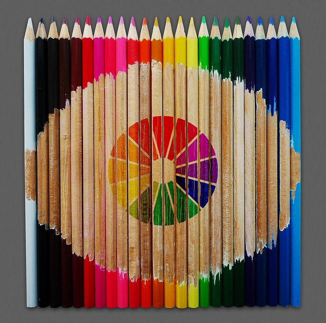
Just to get you guys in the right frame of mind, lets have a look at the color wheel shall we…
Without getting into a major color theory conversation, lets address 2 simple color relations that get on really well…
Complimentary– Colors across the color wheel from each other.
Analogous– Colors that are neighbors on the color wheel.
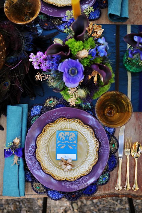
The beauty of these combinations is that they are nature designed to be wonderfully harmonious and pleasing to the eye. In fall we are dealt a hand of reds, oranges and yellows. Commonly people feel most comfortable selecting one of those colors so as to go with the color flow if you will, however, nature serves you up the perfect counter parts that seamlessly slip into a fall setting! Opposite these colors on the wheel are their cooler counter parts in blue, green & purple….. YES what I am saying is, in the right tones, in the right pieces, these cool hues can be THE perfect fall palette, excuse the typical by injecting some much needed freshness into a fall fete with their nature derived counterparts ! Boho-Weddings featured a gorgeous Egyptian inspired shoot which highlighted tones of purple, turquoise & gold, a combo that would be stunning set against their complimentary friends of yellow, orange & pops of red!

*Photograph by Brienne Michelle Photography
Color as a whole is but just a fraction of what makes the above place setting so attractive. Choosing the right colors is always a bit tricky, but when your able to find just the right shades and tones true magic can happen. The harmony to the above setting is that the colors ride on the darker side of things, they envelope you with their dark rich lushness, which after all, isnt that what fall is doing, inspiring the desire to cuddle & wrap yourself up for warmth? Between the perfectly selected dark blooms to the deeply hued beaded place mat but most especially the grounded deep table runner, the color design evokes not just a sense of wrapping one self up in a gorgeous blanket but a sense of serenity and calm. Lighter tones in the form of the turquoise napkin, escort card, and lilac blooms conversely provide just the right amount of counterbalance to all the darkness. Be sure when put together your designs that you balance the scales at times. These dark deep colors are as effective as they are because the light tones remind you just how deep and rich they truly are!
While the tones of blue, purple and turquoise sweetly match any nature derived palette, there is something super clever going on that perfectly lends itself to fall, can you guess? GOLD! Gold is the great olive branch here. If there was a question about the cool dark palette, gold is the tie that binds if you will. Not to over power things, the use of gold in this setting is just how Goldielocks would have explained it…. Juuuuust right! Items like the gold salad plate, flatware and spray painted succulents provide the perfect bright pop to energize the table and inject some of those golden tones we see forming outdoors around this time. I am really crushing on those succulents, all you pine cone people, I see your pine cones and raise you gold succulents!!
This place setting, styled in all its bohemian glory and funk, dressed in deep cool hues is the perfect answer to your status quo fall color palettes. Dont be afraid to inject a different idea into things. The harmony comes in color selection and placement, be methodical and calculating, appealing not just to an obvious outward dynamic like colors we typically see in fall, but the smells and feelings that we have come to know around fall time. These senses can be just as powerful of an idea generator and naturally pair so beautifully with the show that is being put on just outside our doors! Are you loving the bold idea of breaking away from a typical fall color palette or are you more of a traditionalist? How about those succulents, they truly need to be the new fall ‘pine cone’! No matter how you slice it, there is a world of color to embrace and never feel boxed in just because the leaves around you are tumbling in waves of gold, orange & red!
Vendor Love
Flowers, Tablescape – Petalicious | Photographer – Brienne Michelle Photography | Vintage Furniture – Emilee – Tasteful Tatters | Paper goods – Rachel & Tammi – The Pomegranate Basket | Head piece, earrings, arm cuff – Christy – CK Originals | Make up – Erika Arciniega | Hair – Kelly Demoz


