I am really excited to announce a new weekly feature on the Wednesday of each week called Why It Works Wednesday. I have been marinating on this for sometime now and am excited to finally get the ball rolling. Before I jump into the first post, allow me to explain what exactly WIWW {no why I am writing that out each time ;)} is. Each week I will be featuring one gorgeous element to a wedding {in photograph form} that has been pinned, tumbled, stumbled you name it. Class favorites if you will, be it from the weddingverese or directly from our amazing features here. The goal of WIWW is to explore what elements about said table set up, cake, bridal look etc, are at play that make it the amazingingness that it truly is. Often everyone saves images for later, never fully understanding the why of how it all works so well together. My goal for this section is to literally laundry list the elements at play, hopefully bridging that design gap from editorial awesome to something everyone will be able to take something away from to become more stylish! Let’s get started shall we!?
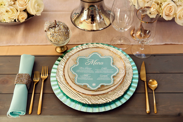
Today’s feature comes to us from Ruffled Blog: Mint and Gold Winter Wedding with Utah Events by Design at the helm of things. While the feature is indeed a winter time styled shoot, the color scheme is a classic, one that easily transcends time of year. Our focus for today will be the place setting portion of the shoot which is dripping in minty golden goodness.
 *Photograph by Pepper Nix Photography
In my humble opinion, there are two very major elements at work in the design aesthetic along with three complimenting lesser features. The two design big boys in this table setting are texture and shape. Let’s tackle texture first. There are a quite a few interesting surfaces within this setting, starting from the ground up, the table itself provides a smooth organic surface leading the way for a what is in contrast, a busy plate setting. The base charger has a gently rolling wave pattern, while the dinner plate has a strong and powerful wood grain impression. The build from the smooth table, to gently rolling wave to forceful wood grain builds much like a crescendo does in music. Serving as the perfect punctuation, the softly frosted salad plate at the top, with snowflake print, compliments both the gentle & bold patterns, keeping the texturing in motion. The plate in this stack that is perhaps the unspoken star, the anchor if you will, is the simple cream one with gold rim. This piece serves as a calm in the storm, something to break up the chaos if you will, yet hold it all together so beautifully. Without this mid layer, the various textures would be simply competing with one another, screaming for attention. It is ever so important to always provide the eye with a break, a calm, when designing just about anything. Two other strong textures on the table are the bold square beaded napkin ring, beautifully set against the smooth napkin and the enchanting glittered apple set up in its own smooth palace. Each works wonderfully with the table as a whole, not to mention how it echos the plate setting in both forceful & smooth textures.
The other big element at work is shape. The most obvious is the juxtaposition of the softened snowflake shape of the menu against all of the round on the table. By choosing a die cut snowflake menu, the team easily brought in a subtle winter feel as well as finding the perfect counter shape to not only compliment all the round {Plates, glassware, vase base, rose blooms, apple, even the spoon} but beautifully detract from it all the same. Its a much needed break in the table, one that provide a focal pop. Believe it or not, the cutlery is also hard at work & carefully chosen against the voluminous plates. Thin, almost wiry, cutlery balances out the volume of the plate stack, offering a lovely change of pace. Even the billowy lazy fold of the napkin in a strong & structured square napkin ring serves as another guiding piece to the shape game. Each working to harmonize with the other while being a standout on its very own.
The three smaller elements of design that are equally as important are color choice, lines and the apple. The tones of soft mint & muted gold are a wonderful departure from the screaming hot mint & brassy golds we typically see. These relaxed tones allow for a calmer, more soothing feel to the table, one that creates an inviting & welcoming table. Lines are quietly playing in the background, from the wood slates in the table to the paralleling table runners, each creating a contrasting movement against the plates, cutlery & so forth. There is a quite motion to the table, reinforcing the soothing nature of the color choices. Lastly, the apple. While it might seem a trivial thing, I absolutely love it. It is the whimsy the table needs and wonderfully pairs with the organic feel of the wood table. Its a simple touch, but one that serves to bring a spot of life into such a soothing environment.
So what do you think of this gorgeous setting? What elements are you loving and likely to borrow for your own designs? What are you feelings on the softened mint and muted golds, are you a fan of toning them down? I would love to hear what your thoughts are! Likewise I would love for you to send me beautiful set ups that you’d like to see featured on Why It Works Wednesday, so please send them along! Xo~ Jess
To view the full feature {and you should its amazing!!} on Ruffled Blog, Click Here
Shoot Location: Sandy, UT / Photographer: Pepper Nix Photography / Event Design, Planning, and Table Decor: Michelle Cousins of Utah Events by Design / Shoot Venue: La Caille / Wedding Flowers: Urban Chateau Floral / Wedding Dress: Monique Lhuillier “Candy” via Alta Moda Bridal / Bridesmaids’ Dress: Alfred Sung via Lily and Iris / Hair: Kali Wengreen / Makeup: Kristen Packard / Wedding Cake: Cake-a-licious / Table and Flatware:Diamond Rental / Wedding Invitations: Freshly Minted Invitations / Calligraphy: Distinctive Inscriptions Calligraphy


